The Wolverine
Director James Mangold
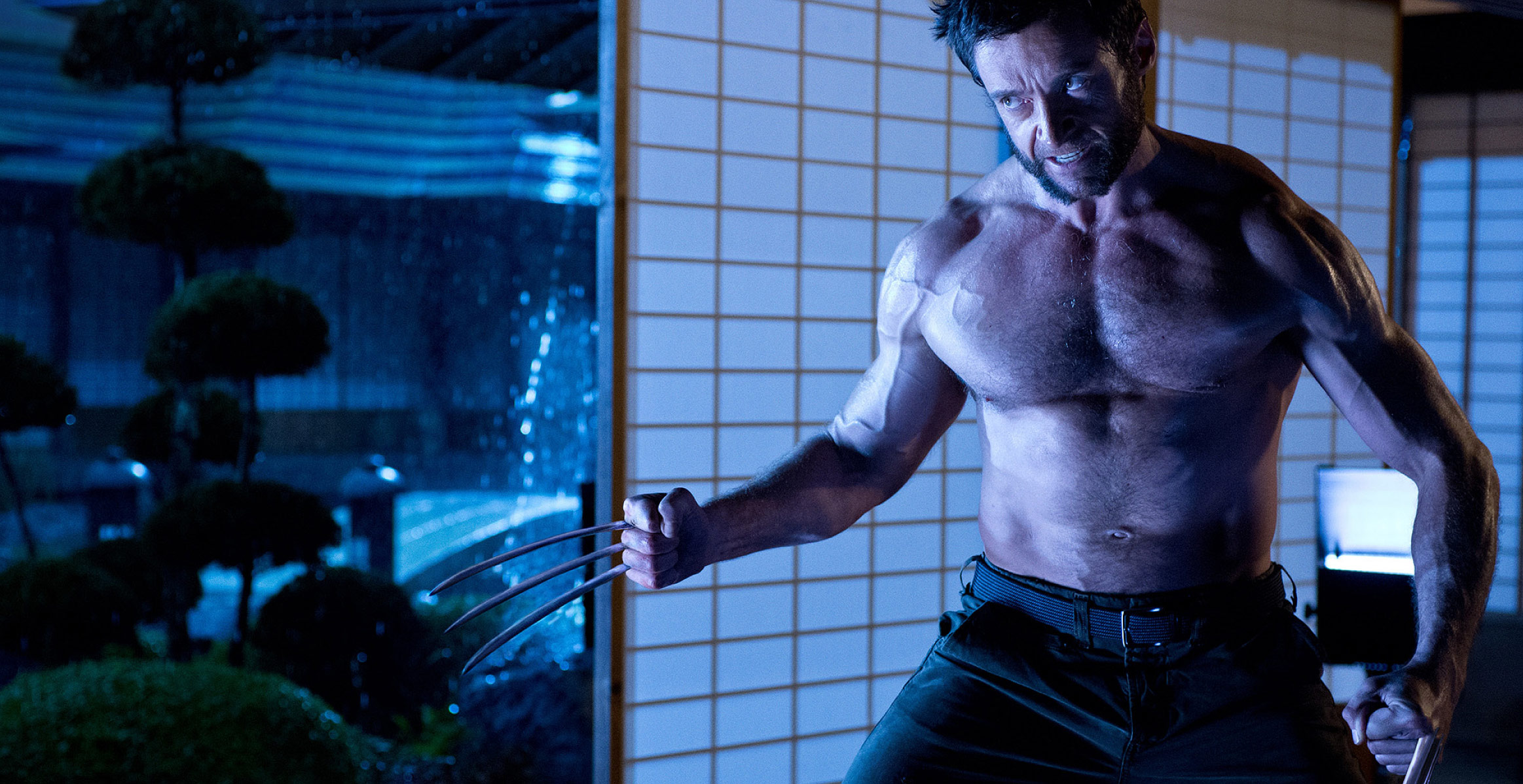
Instead of expounding a tedious origin story or staging an epic battle for apocalyptic stakes, ‘The Wolverine’ focuses on a specific and self-contained adventure in a richly imagined place.
a.o. scott, the new york times
Read the full article
in perspective magazine
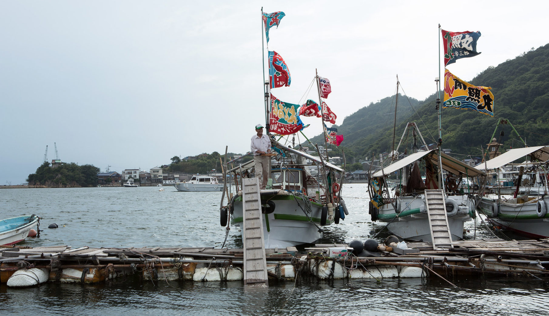
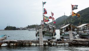
Logan sat down on a low stone wall overlooking the bucolic Japanese harbor filled with a handful of small fishing boats, their colorful flags fluttering in the breeze. A setting sun cut across the water at a steep angle, while several islands dotted the horizon like emerald paper cutouts.
Granite ishi-doro lanterns stood at attention every 20 feet along the waterfront path, winding away to a distant torii gate and shrine nestled in the maple trees ahead.
This was a quiet scene between Logan (played by Hugh Jackman) and a Japanese actress named Tao Okamoto, with the dialogue subtle and nuanced. We were shooting in a tiny fishing village on the West Coast of Ōmishima Island, in Hiroshima Prefecture, but the most surprising part of all was that we were shooting an X-Men film.
“The Wolverine” is the sixth instalment of the X-Men film series, but tells the most personal story of them all.
Set seven years after “X-Men: The Last Stand,” Logan is living in contemplative solitude in the mountain wilderness of the Yukon.

searching for logan’s heart in exotic japan

All images and videos © 20th Century Studios
Reluctantly, he is invited to Tokyo to bid farewell to a dying octogenarian and billionaire named Yashida, an old friend from his past.
But instead of a quick goodbye, Logan becomes embroiled in an adventure involving Yashida’s many enemies, his conflicted family, and his enrapturing daughter. The adventure zigzags Logan from Tokyo to an Osaka love hotel, then to a remote fishing village outside Nagasaki, and finally North again, past Tokyo, to a mysterious mountain village in Nagano Prefecture.
At its core, “The Wolverine” is a road movie through a foreign land, and one of my first instincts was to push the diversity of the stops along this road in order to build intrigue. I was always steering away from the clichéd depiction of Japan and looking for the unique to heighten the feeling that we were seeing a side of the country hidden from public view. One of the marvellous things about Japan is that it offers up a wealth of diversity in its architecture, landscapes and pop-cultural anomalies, and I wanted to tap into that visually.
James Mangold hired me in July 2011. A November shoot date was already set by 20th Century Fox, so design development ramped up quickly with illustrators Michelle Moen, Steve Jung and Manuel Plank-Jorge generating concepts out of Mangold’s Santa Monica offices.
In researching Japanese architecture, I learned that many contemporary pillars of modernism have their roots in Japanese architecture, and I found it fascinating how architects such as Frank Lloyd Wright, Mies Van der Rohe and Le Corbusier were radically inspired by their own travels through Japan.
Jim and I were rarely concerned in making sets “film friendly,” as Jim has a realist aesthetic focused on capturing performances rather than settings. The camera remained in the physical constraints of the sets, and I think we wilded one wall during the entire shoot.
I enhanced the feeling of reality by always building full ceilings with practical fixtures. We overcame any photographic limitations by designing the choreography of the camera into the set designs, without having to resort to wild walls or ceilings.

The u-shaped Yashida residence was carefully designed around specific camera angles for each of the scripted sequences.
© 20th Century Studios
Chapter1
Stage Build
Yashida
Compound
One of our biggest stage sets was the contemporary Yashida Compound overseen by Assistant Art Director, Simon Eisley. Yashida was meant to be the most powerful man in Japan, living in a massive compound outside Tokyo.
These sprawling compounds simply don’t actually exist in Tokyo, as even luxury properties are small compared to those found in the West.

I took inspiration from several residences owned by the Japanese imperial family, namely the Kyoto State Guest House built by Nikken Sekkei in 2005.
I designed the compound to be an immersive in-camera experience that sets up the complicated dynamic between the various members of this dysfunctional family. Jim imagined the Yashidas as a sort of Japanese version of the Mulwrays from Chinatown and wanted opportunities for views across the central garden, almost like family members could spy on each other like James Stewart did in “Rear Window.”


© 20th Century Studios


All these key views were designed beforehand in 3D, and I spent a great deal of time working out the choreography of the camera with Jim during prep. Most of the elegant furnishings, custom light fixtures, and other “priceless antiques” in the compound were designed and built in-house by our specialty prop builders supervised by Peter Wyborn.
The central garden and pond was a real challenge and character piece because, with Japanese landscaping, every detail and composition of rock, water, and plant is imbedded with symbolism. We really had fun with the garden and even included rubber koi fish in the shadows of the pond, made neutrally buoyant with wires.
“Your grandfather called me a ronin, a samurai without a master. He said I was destined to live forever, with no reason to live.”
Hugh Jackman as Logan
One of the most intriguing parts of the compound was the high-tech bed Jim scripted for Yashida’s chambers. The first big scene of the film is a dialogue between Logan and Yashida, and it does a lot of heavy lifting, not only in its exposition but also in its thematic weight. Yashida basically offers Logan a way out from his burden of immortality, and we learn that both characters want what they each can’t have.
As a contrast to this dialogue, Jim wanted there to be a bit of technology that would add a degree of surrealism to the scene, and we ended up settling on a design of a “pin bed” inspired by those pin art gadgets where you press your hands down and the pins retain the shape of your hand.
Jim loved this idea and the bed created this enigmatic additional layer to the scene that was beautiful and enchanting at the same time.


For many shots, there were no “pins,” only green Lycra stretched over an SPFX rig, and Hal Yamanouchi who played Yashida, had to mime the affect of being manipulated by this crazy bed.


“When I was a little girl, I had nightmares. I’d wake up and run to my parents. My father would get angry. ‘Go back to bed. Face your fears.’”
Tao Okamoto as Mariko
For the Japan shoot, we had the exciting opportunity to base out of the Toho Studios in Tokyo, home to Godzilla and “Seven Samurai.” Local Art Director Wataru “Lenny” Hirai was teamed with LA-based Art Director Rika Nakanashi, who facilitated many “lost in translation” moments.


© 20th Century Studios
The overall strategy was to use Japan for wide exterior locations that could never possibly be recreated on a studio stage or in Australia.
The schedule dictated that we would concurrently prep both Sydney and Japan, with the first several weeks set for Sydney, then a few weeks in Japan, followed by the remainder of the schedule at Fox Studios Australia and around the Sydney. This meant I would need to concurrently run two art departments—one in Sydney and another in Tokyo—so regular back-and-forth visits were required.

James Mangold’s film features some breathtakingly suspenseful action sequences, and exquisite production and costume design…It has such a strong aesthetic about it, it’s almost as if ‘The Wolverine’ functions as its own stand-alone film, rather than as a piece of the ‘X-Men’ mythology.
Christy Lemire, rogerebert.com
Chapter2
Location
Buddhist Temple
in Tokyo
For the first week, we shot at the Zōjō-ji Temple in central Tokyo, and then captured the bustling city streets of Tokyo.
A true film scholar, James Mangold had me study films that would serve as his inspiration for his picture, including the Japanese films “Floating Weeds,” “The Samurai Trilogy” and “13 Assassins;” as well as American classics like “Black Narcissus” and even the “Dirty Harry” films.


© 20th Century Studios

The funeral sequence used two locations cut together as one: the Zōjō-ji Temple in Tokyo and the Chinese Garden of Friendship in downtown Sydney.
A traditional Japanese pavilion called an azumaya was built into the the central pond at the Chinese garden in Sydney. Chinese architecture details were hidden or covered by more Japanese details to create the illusion of shooting in the Zōjō-ji Temple in Tokyo.
Chapter3
Stage Build
Osaka
Love Hotel

On October 8, 2012, production returned to Sydney. Back in Australia, it was a whirlwind of work, with four stages at Fox Studios jamming with set construction.
Because of the difficulties of controlling Tokyo streets, we also dressed several full streets in Sydney to look like Tokyo streets and back alleys, as well as an Osaka hotel quarter. This proved to be a massive effort, revolving around the complexities of short preps on traffic corridors and constructing hundreds of lit Japanese signs.
Leading this charge was Graphic Designer Michael Wholley assisted by Nadia King, and they did a truly remarkable job of recreating this very specific and textured look.

© 20th Century Studios

© 20th Century Studios
The exterior of the love hotel was inspired by the Nakagin Capsule Tower in Tokyo, a rare example of Japanese Metabolism architecture. We scouted the Capsule Tower in Tokyo but it was deemed too complicated to shoot as a location due to the municipal restrictions on shooting. The exterior ended up being a CG composite onto a street in Sydney.
For the interior, I chose a campy space theme for the décor. We printed custom carpet and built all the furnishings including a rocket-shaped vending machine that dispensed sex toys.

Chapter4
Location
Nagasaki Fishing Village
& Rural Cottage
Another highlight was a traditional Japanese mountain village that we built in a parking lot adjacent to Sydney’s Olympic stadium. Assistant Art Director Jenny Hitchcock oversaw this set.
When Jim signed on to direct, one of his first notes was that he wanted Act 3 to feature a sort of Western town showdown, which he found inspiration for in films like “13 Assassins” and “The Outlaw Josey Wales. “


© 20th Century Studios

© 20th Century Studios

I was surprised to learn there are a number of remarkably preserved Edo-period villages on several ancient postal routes, lost in the mountains of Nagano Prefecture.
When I visited the village of Narai-Juku, I was delighted to be loaned a one-of-a-kind hand-drawn architectural survey by the mayor of that village, which became our rulebook for the set we built in the parking lot back in Sydney.
Originally, the ice village set was intended to be built in our largest stage at Fox Studios, Stage 7, but the set moved outside as the complexities of lighting, stunt rigging and set extensions mounted.
It was ultimately the best decision to move the set outdoors, as we were able to create much more depth and realism in both the scenery design and lighting.
One of the biggest challenges was creating snow-covered roofs that would allow stunt performers to both run across and ride motorcycles over, and a week before shooting, it was looking scary as stunt performers were slipping all over the set. We ended up securing white netting to the roofs, over a blanketed snow membrane, which thankfully solved the problem.
Practical lights were used wherever possible, and our DP Ross Emery helped us design custom street lighting that were all on dimmers. We added some lit street signage and also dressed in chouchin lamps, which are sometimes called “china balls” and are basic bamboo frames wrapped in paper. These created accents of color but also enhanced the depth of the street.

© 20th Century Studios


A 20-foot high scaffolding was erected to create the illusion of a steep entrance to the ice village set, and to give the pancake-flat parking lot a mountainous feel.
The concept of the snow-plow barreling down the narrow streets came from an Art Department brainstorm. Three snow-plows were built, adapted from Zamboni ice resurfacers. One featured rubber spinning blades, while another was rigged on a giant “lazy susan” type rig to simulate a spin-out.
If you watch this sequence carefully, you will notice that the artificial snow moves unnaturally under the feet of the samurai, as they navigate a path along the rooftops.

© 20th Century Studios

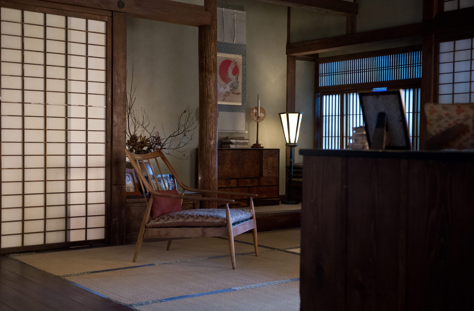
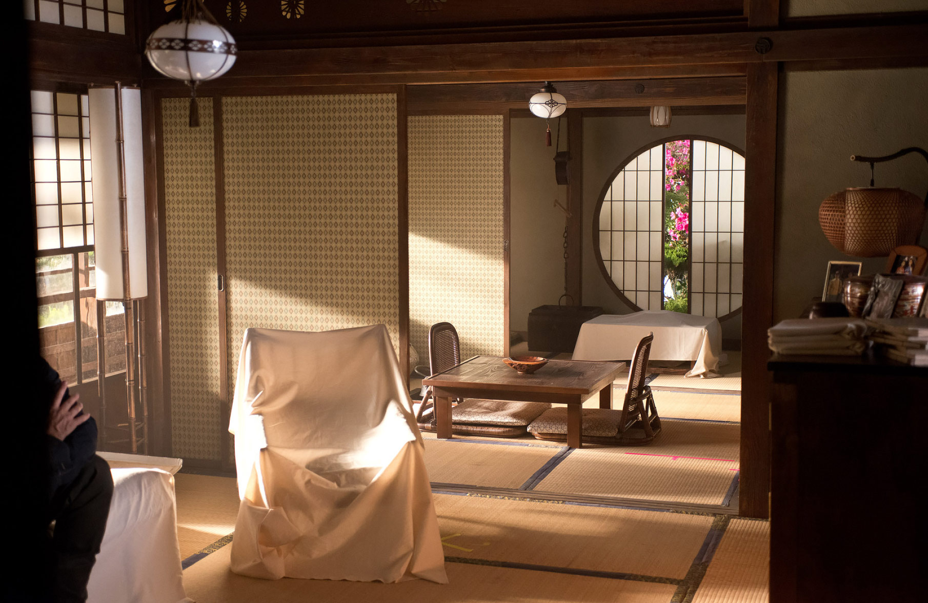
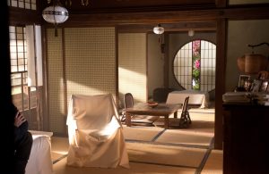
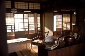
The actual cottage was a remarkable place, built on a promontory overlooking the harbor village of Tomonoura. (It was, surprisingly, the vacation home of Japanese film director Hayao Miyazaki who set his film “Ponyo” in a village inspired by Tomonoura).
The cottage was lit by practicals, which DP Ross Emery then enhanced from the floor. Set Decorator Rebecca Cohen designed traditional Tsuridourou hanging lanterns for the hallway, with ornamental patterns laser-cut and lined with paper. The cottage also had banbori lamps, which are a traditional six-sided floor lamps made of paper and wood.
After an exhaustive effort of scouring the country for villages with the correct narrative elements, two rural fishing villages were found outside Fukuyama.
In the town of Tomonoura, we found a cottage that was scripted as the Yashida family vacation home. The cottage was a crew favorite.
The interior was built on stage in Sydney, and was a near replica of the location, with subtle tweaks to the layout and palette. Great effort was taken to recreate the finishes like the timber frame construction, traditional wara juraku plaster walls (made up of natural sand, clay and rice stalks), and the wallpapered fusuma sliding panels.
It was important for me to imbue the set with a sense of history—that this was a place the Yashida family visited regularly when the children were young, but was then forgotten. For example (Yashida brand) kitchen appliances from the 1960s and 70s were dressed into the cramped kitchen.

Gallery
Chapter5
Location
Mountain Village
in the Yukon
For the film’s opening, we created a small Yukon town in a suburb of Sydney called Picton.
This was a main street covered in snow and an adjacent hardware store and bar.
I kept the colors monochromatic with a dirty yellow as our only accent, so the palette could later snap to life when Logan arrives in Tokyo.
I was invited to oversee an effects unit for background plates, and found the perfect mountain backdrop in Banff National Park in Alberta, Canada.

© 20th Century Studios

One of the challenges of shooting in Australia was the absence of pine trees, which are not indigenous to the continent. A lumber forest several hours West of Sydney stood in as the Yukon.

© 20th Century Studios

An old hangar at Sydney International Airport was aged with paint, and a foam-based synthetic snow was used to create the cold Yukon aesthetic.
Chapter6
Stage Build
Bullet Train

During this very busy time, the studio agreed to add an additional action scene—on a bullet train, naturally. For logistical reasons, it was agreed to film the entire sequence on stage in Sydney.
Set Designer Jacinta Leong quickly produced working drawings for a 100-foot section of our Shinkansen-style bullet train, as well as a second roof set to be built on the same stage.
“What kind of
monster are you?”
Will Yun Lee as Harada
The interior of the train was dressed with seats upholstered in striking red fabric. A full practical bathroom was also built, which Logan recuses himself to after discovering he is bleeding profusely. Dozens of realistic graphics were reproduced — documented during my scouts on the actual Shinkansen, traveling from Tokyo to Kyoto.
In no time, Logan finds himself in a no-claws-barred fight with Yakuza assassins. The fight starts outside the bathroom — then with a few slashes through the rubber accordian connecting the cars, transitions to the top of the hurtling train. To create this sequence, two sets, one for the carriage interior and one for the roof, were constructed in Sydney’s Fox Studios.
The train set was then redressed with a Tokyo train station platform built alongside, with backlit wayfinding signage and Japanese vending machines.


* No actual bullet trains were harmed in the shooting of this picture!
Chapter7
Stage Build
Yashida
Research & Development Lab
The end of the film culminates in a towering Yashida lab, built into the side of the mountain above our “ice village.”
I looked at communication towers, and found a few that looked like pagodas when you looked up at them, with horizontal fins resembling stacking architectural roof structures.
The set itself was a 43-foot tall multistory structure that would be redressed for several floors as the action moved vertically through the tower. The logic behind the architecture was that the tower had been designed as a vertical assembly line for products built by the Yashida Corporation, with each floor providing specific assembly and developmental purposes for various electronic inventions.

© 20th Century Studios

“I can make you
mortal.”
Hal Yamanouchi as Yashida
The center of the lab set featured a practical rotating gantry and catwalk, which offered opportunities for interesting moving camera angles.
One wall of the space was redressed overnight to expose the aftermath of a blast hole. A partial exterior was built to feature Logan dangling over the precipice, composited below.

© 20th Century Studios
Adding to the complexity of the set was that we also built a practical nine-foot tall armored suit, which was completely posable (although it weighed in at 1,500 lbs).
It was great value to have this practical “Silver Samurai” armor in the practical set, even though it would be CGI during the subsequent animated fight sequence, as Ross Emery was able to dial in the lighting and reflections of the set, as if he were shooting a car commercial. Also, Weta Digital were able to streamline the process of programming textures and shaders by duplicating the metal finishes that we created for this specialty prop.
CONCEPT ILLUSTRATION (Below) by Wayne Haag
© 20th Century Studios


Chapter8
specialty prop
Silver Sumarai text by andrew chan

The “Silver Samurai” is a fictional 9-foot tall cyborg made “head to toe from pure Adamantium.” He was required to look indestructible, beautiful and represent the might and fortune of the Yashida Empire.
The process of creating the Silver Samurai began in LA with François working with Concept Artist Josh Nizzi to create 2D/3D digital concept art (2D Photoshop™ paint over a 3D speed model). Concept Illustrator Paul Ozzimo refined the design into a highly detailed 3D model using Softimage™.

© 20th Century Studios
Access to the lockable joints and internal cavity was achieved by removing panels and armor held in place by rare-earth magnets, which allowed invisible fixings and fast access. As the armor and armature were modeled digitally, the accuracy of the components interlocked together perfectly.
The support frame was built on a dolly to allow the Samurai to be positionable in most places on set, including the narrow central catwalks.
The structural frame and pose-able joints were engineered to allow as much movement as the body armor would allow.

© 20th Century Studios
Assistant Art Director Andrew Chan imported Paul’s model (via FBX) into Rhino™ for further design development.
During design development, the Samurai was broken down into components and labeled, and full size elevations were printed. This information was used by Props HOD Peter Wyborn to consider various build options and estimate a cost. Initially most of the components were to be manufactured in house, but the limited 12-week build time, led the decision to manufacture most of the parts towards CNC and Rapid Prototyping and away from conventional hands-on props/model making. Although, in addition to using “hi-tech” automated processes, some parts were easier to sculpt by hand. For example, Leading Hand Lewis Morley created the complete boot assembly from full size working drawings.
Most of the meshes in Paul’s 3D model were already fine-tuned for CNC manufacture, which was ideal. For the suppliers who required nurbs surfaces, we used the T-Splines™ plug-in for Rhino. T-Splines converted even the most complex and detailed meshes into precise smooth polysurfaces, which saved us a heap of time.

© 20th Century Studios

From the Rhino final model we exported; STL meshes for 3D printing and stereo-lithography, Nurbs IGES files for five-axis CNC routing, OBJ meshes for three-axis CNC milling, and DXF files for 2D laser cutting and engraving. We produced working drawings and templates for in-house model making, sculpting and structural frame engineering and an IGES export for further in-house structural engineering in Solidworks. An OBJ file was sent to Z Models in Queensland to print a detailed 1/5th scale model in 3D.
The smaller and more detailed components were built using stereo-lithography and 3D printing.
Stereo-lithography was used by Solid Concepts; in Perth, Western Australia; to produce photopolymer liquid epoxy resin parts.
For 3D printing, we used Rapid Prototyping Services in Sydney and Moddler in San Francisco who produced polypropylene parts and acrylic monomer resin parts respectively. Many of these ‘plastic’ parts were used as hero pieces in the final build. Other parts were molded for multiple castings in urethane resin. Mo Milling in Sydney then did CNC machining of the Samurai’s aluminum swords.


The final weight of the Samurai, including frame and dolly was 1,500 lbs. and it was made from ~500 parts built over 12 weeks.
Cost: $350,000, including duplicate helmet and shoulder piece for damaged version, and additional rig for actor wearable version.
For the larger components, we used Mouldcam in QLD to produce a combination of MDF patterns (replicas) and moulds using their 5-axis CNC router. The supplied patterns were molded in silicon, and then laid up in fiberglass. The moulds were directly laid up in fiberglass.
Mouldcam supplied many multi-part moulds designed to fit together and be taken apart, allowing for complex parts to be fiberglassed as a whole.
The surfaces of every part supplied by CNC or Rapid prototype were hand finished and primer painted by the prop makers in house prior to molding and casting. The surface finish had to be perfect before they were sent out for nickel electroplating and automotive carbon fiber transfer.
Chrometech in Sydney were used for the electroplating. With their process they can electroplate practically any material. Our various parts were fiberglass, urethane, polypropylene, and epoxy. An initial concern was to allow enough time for the chrome electroplating process. On average, parts took five or five days to electroplate. In the latter stages of construction there were constant shipments of parts coming and going and we were grateful that the electroplaters operated seven days a week for us. After electroplating, the parts were hand-sanded and finished to give them a machined/brushed stainless steel look.
Whilst the outsourcing of components for manufacture was taking place, an in-house team headed by Leading Hand Luke Gasparini and Engineer Raytheon Buna were set the task to design and build the internal steel armature. The original brief was for a standing pose-able character but later requests included a cavity within the Samurai that an actor could climb into, and for the Samurai to sit and lie down.
Materials used: aluminum, steel, fiberglass, epoxy resin, acrylic resin, urethane resin


Chapter9
Location
Nagasaki Prisoner
of War Camp
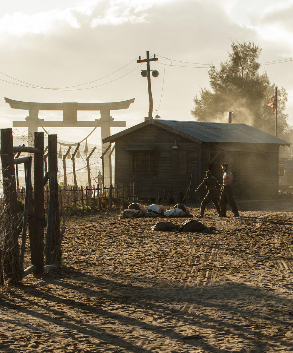
August 25, 2012 was the first day of shooting, and began with a 1945 Japanese POW camp, which I designed in SketchUp with Andrew Chan.
Photoshop paint-overs were created to address color, texture and lighting. This 3D approach allowed me to set up specific camera angles so the layout of the structures lined up with the location to create beautifully dynamic compositions.
The exterior of the camp was built on Sydney’s Botany Bay, with an enormous torii gate erected onto the shore.
The exterior location was struck and redressed for a sequence where Logan and Mariko return to the same site of the camp many years later.
A 30 foot deep interior well was built on stage, manufactured from plaster and lathe over a steel scaffold.


© 20th Century Studios


© 20th Century Studios
“The Wolverine” was a dream project, with fantastic learning opportunities, and the experiences of collaborating with my Japanese and Australian crews were profound.
I am extremely grateful to my entire design team for helping create a unique and memorable film with personal character and style.
Art Department Credits
- Supervising Art Director
- Ian Gracie
- Art Directors
- Michael Turner
- Wataru 'Lenny' Hirai (Japan)
- Rika Nakanishi (Japan)
- Assistant Art Directors
- Andrew Chan
- Simon Elsley
- Jenny Hitchcock
- Shiori Saito (Japan)
- Set Decorators
- Rebecca Cohen
- Tomomi Nishio (Japan)
- Research Consultant
- Ozzy Inguanzo
- Concept Model Maker
- Geoff Kemmis
- Concept Illustrators
- Wayne John Haag
- Manuel Plank-Jorge
- Steve Jung
- Michele Moen
- Gerhard Mozsi
- Josh Nizzi
- Paul Ozzimo
- Aaron Sims
- Senior Draftsperson
- Alanna Baudinet
- Storyboard Artists
- John Coven
- Daniel James Cox
- Todd Harris
- David Russell
- Graphic Designers
- Michael Wholley
- Nadia King

