NEOM:
Made To Change
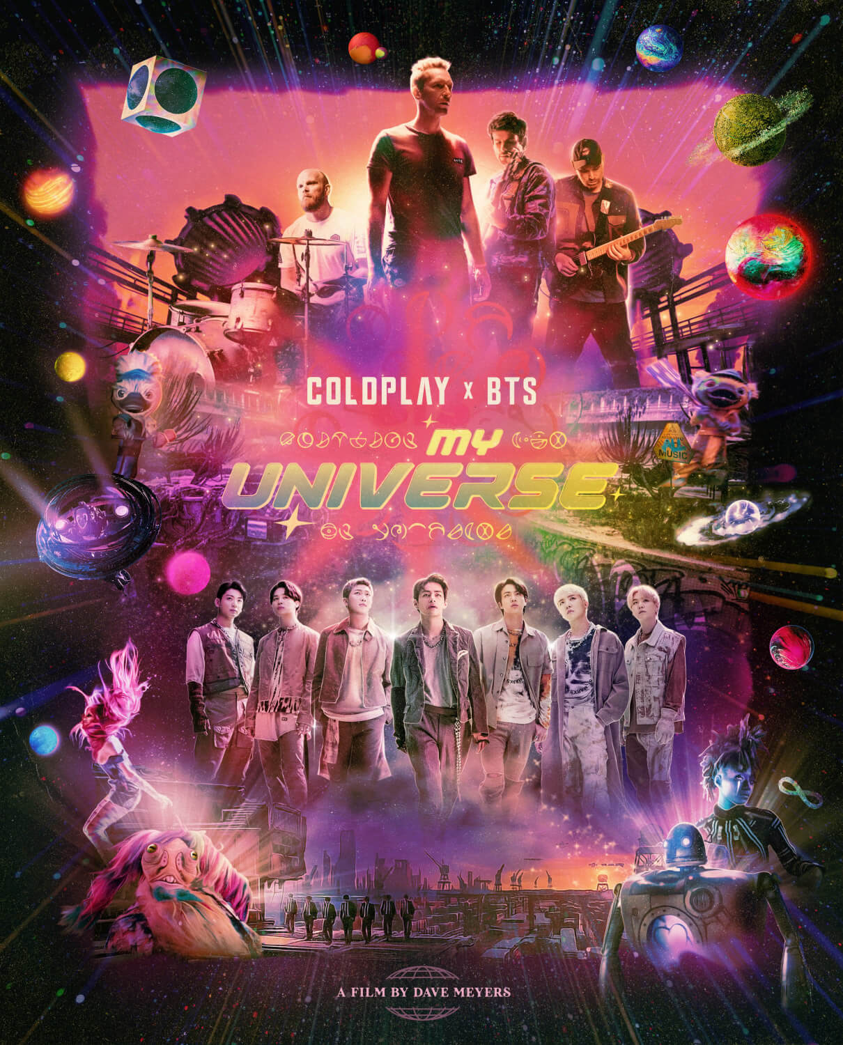
Director Dave Meyers
NEOM is a bold and audacious dream. It’s a vision of what a new future might look like. It’s an attempt to do something that’s never been done before.
NEOM.com
Index
- Introduction
- Chapter 1: Since the Beginning...
- Chapter 2: Change...It’s In Our Genes
- Chapter 3: An Empty Canvas
- Chapter 4: Cities Become Playgrounds
- Chapter 5: Designed to Live With Nature
- Chapter 6: Factories that Make the Future Better
- Chapter 7: Lifelong Learning
- Chapter 8: Predictive & Preventative Technologies
- Chapter 9: A Museum of Money
- Chapter 10: Exploring the World Around Us
Photo by Jorge Vujosevich
Video Still © NEOM
NEOM is described as “a new vision of what the future could be” as well as “a home for people who dream big and who want to be part of building a new model for sustainable living.”
To create this vision of a new future, (NEOM literally means “new future”), it was only fitting that the advertising agency called upon director Dave Meyers and his creative team to realize this expansive world.
The project called for 18 sets to be designed to be shot in one uninterrupted pull back crane shoot—all within a condensed prep schedule, a shoot scheduled in Mexico City, and visual effects to be produced by UPP VFX in Prague, Czech Republic.

a new vision of what the future could be…
The vision was for the audience to not only be traveling through physical space, but time as well—starting 40,000 years ago in a primative cave, and continuing past motifs that descibed humankinds progress and evolution into the future.
In other words, a big dream!
Chapter1
Stage Build
Since the
Beginning…
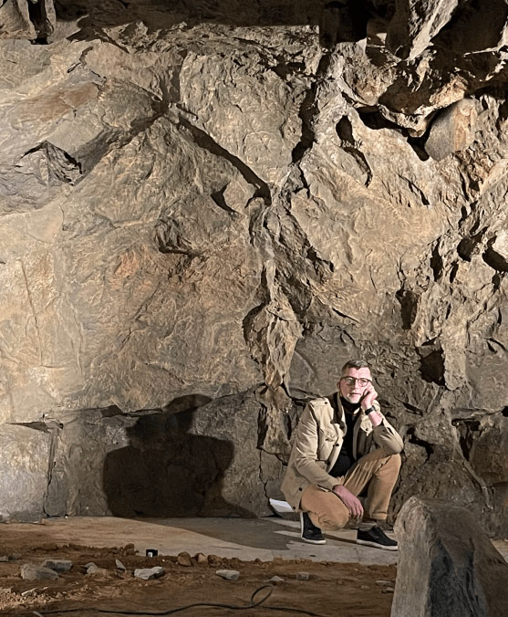
To build the cave set, Mexico City-based Art Director Jorge “Vujo” Vujosevich engaged a 27-man sculpting crew who pulled squeeze molds from granite cliffs located within Mexico City.
“I interviewed two different sculptors and neither had a clear idea of how to build it,” said Vujo. “When I interviewed the third artist, Marco Palma, I knew that he was the one for the job.
“Palma had one week to fabricate the molds and one week in the studio to set them up. It was a very tight schedule.”
Fiberglass skins were formed from the molds and assembled over a simple lumber framework, and then painted in a palette to match photo-reference from caves in Indonesia.
Primal parietal art was painted onto the cave walls and a practical fire, drying racks for pelts, and primitive cookware were dressed into the space by Set Decorator Florencia Rodriguez.


Working with Director of Photography Scott Cunningham, the crew sawed holes into the cave ceilings so that sunlight shafts could penetrate the space at precisely the right angle to match the concept illustrations by One Pixel Brush.
Since the beginning, we’ve
NEOM
changed things.

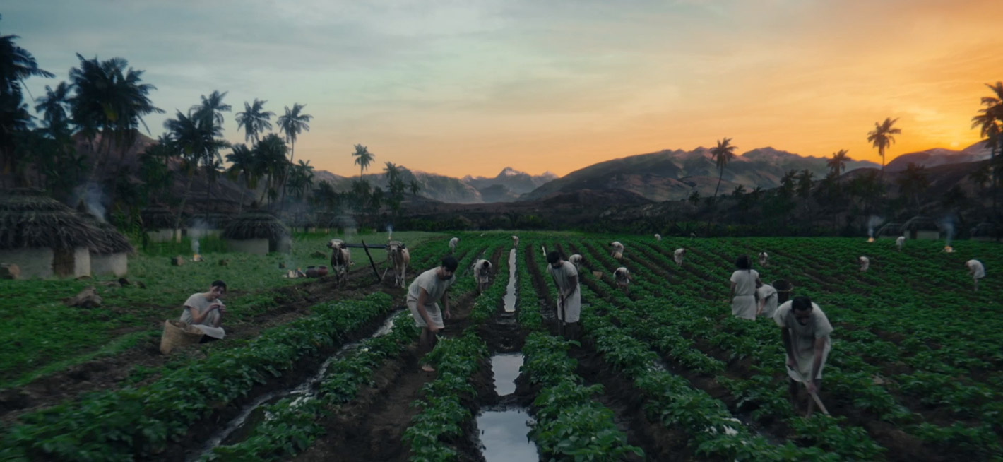
For the mesopotamian agricultural scene, a potato field was selected, located an hour-and-a-half drive southeast of Mexico City in Juchitepex, Morelos. Several furrows were flooded as if the field had been irrigated. Two cows were selected and attached to a wooden yoke, and then trained to pull a plow. The majority of the farming tools used in the set were hand-tooled and aged by the props team.


An exaggerated city was designed to symbolize a greedy world of banking and arrogance. For the foreground, a set As few weeks before the shoot, concept design efforts had begun with One Pixel Brush, led by Creative Director Shaddy Safadi. Building on my design methodology begun in 2021, all environments were constructed in 3D with accurate textures, lensing and lighting data. Assets are designed to transfer seamlessly through production, and into post-production. This process is built to answer design questions in prep, and allow the VFX facility to begin the iteration of VFX shots immediately after shooting is complete, thereby saving precious time and resources.
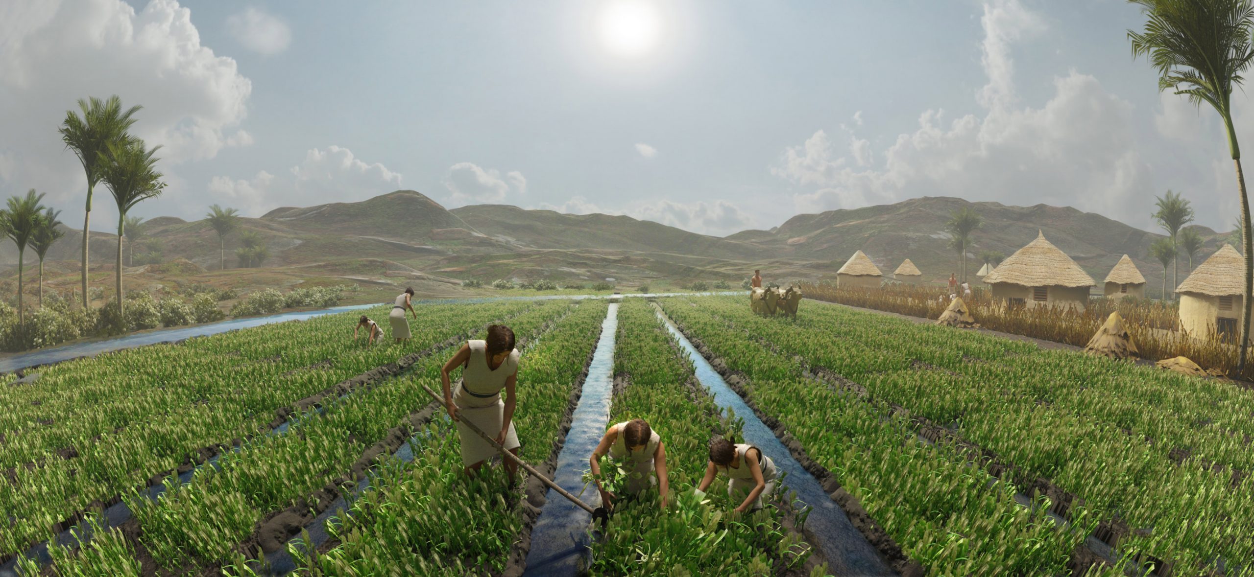
For this project, like many other for Francois, we approached Concept Art in a new way. In the past, concept art could be described as an “approximate idea” of what the final shot would be. Makes sense as “concept” is in the title.
But in the past five years what USED to be done in Photoshop to create a quick approximation of a shot, has evolved into advanced 3D modeling and texturing techniques. These techniques beget concepts that look almost exactly like what we would want the final shot to be. They are also 95% realized in 3D which give the VFX team an incredible head start in creating the actual shot.
It isn’t just an image they look at and recreate but a data-rich 3D model that is already composed and lit in a scene! What makes this possible is incredible artists who learn to become incredibly technical.
Rather than tasking an artist with taking the first steps, we challenge them to pitch us the “final.” The 3D process facilitates this because even if they are “off” with the composition or lighting, it’s all easy to fix. Nine times out of 10, they nail it and an immense amount of time and energy is saved when we trust the creatives with… well the creative.
Shaddy Shafadi
One Pixel Brush

Chapter2
Stage Build
Change: It’s In
Our Genes

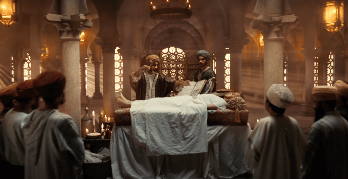
The surgery scene was inspired by a real life surgeon and scholar named Al-Zahrawi (936-1013 AD) who lived and worked in Córdoba, Spain; and considered by some the “father of modern surgery.”
For the interior space, I took inspiration from the Mosque-Cathedral of Córdoba which is a UNESCO world heritage site dated from the Middle Ages.
“This set was the biggest challenge for me and my team,” stated Vujo. “I am proud that my team and I were able to pull it off.” A four-by-four grid of columns was constructed, measuring 20 feet tall. Decorative capitols were fabricated from foam by sculptor Alberto Yu.
Scenic Painter Eusebio Campos and three assistants applied decorative finishes to all the surfaces. The as-stone tile floor was created using plaster molds.

It’s in our genes. It’s what makes us human.
Neom
To tell the story of the history of scholarship in medicine, we recreated Al-Zahrawi’s book “The Method of Medicine,” by printing photographs of the actual pages onto vellum and then attaching the pages into a custom leather binding.
The pages of the encyclopea included detailed drawings of surgical instruments invented by Al-Zahrawi, which we modeled in 3D using Rhino and then 3D-printed in metal. It was truly amazing when the silver instruments arrived on set, because they were completely practical and seemed plausible as instruments that could be used successfully in surgery, even by today’s standards.


Chapter3
On Location
An Empty
Canvas
Our only interior locations during the shoot was found in the abandoned Acroplis Mall, located in Narvarte, Mexico City.
The flooded site had to be rid of several inches of standing water with pumps the day prior to the shoot.
A large 16×9 aspect ratio canvas was fabricated and hung in the center of the abandoned rotunda, with appropriate painters tools and brushes dressed around to create the effect of an improvised artist’s studio.


“The metaphoric depictions of these moments allow us to create a flow to this film that seem subjective at first, but when paired with the punchline that these are the individual facets that make up Neom’s progressiveness, they become extremely poignant representations,” stated Dave Meyers.
Now we have a chance to change everything. Let’s change water so it flows forever, energy so that it powers our lives sustainablably, and mobility so cities become playgrounds.
Neom
Chapter4
Stage Build
Cities Become
Playgrounds

“In the end we will realize that the child blowing into a spinner to power a city wasn’t just an interesting camera trick, it was a gorgeous depiction of a promising future for a child made possible through sustainable energy,” emphasized Dave Meyers.
I pushed to created the child’s miniature city as a practical set. My prop team built 20 buildings, laser cut from styrene and clear acrylic. The structures were then internally lit with LED neon flex, each individually run to the gaffer’s dimmer board.


We had to carefully measure the camera and dolly, and then position the miniature buildings carefully so they would clear the camera’s path by mere inches.
“While these visuals are metaphoric, they will still be authentic to humanity’s want and need for innovation and progress.”

A large 30-foot diameter halfpipe was built so that BMX bike riders could coast back and forth and then be composited onto a futuristic cityscape. It took the construction team 15 days to build this single structure.

“We used more than 7,000 strips of lumber,” stated Vujo. “Once we wrapped, I wanted to donate the halfpipe set to the talent, but they had no way to transport it. To date I’m still recycling the blue MDF sheets used for this one set.”
Chapter5
Stage Build
Designed to Live
With Nature

Dave Meyers imaged this vignette as “a family’s living room resting in a gorgeous flower bed surrounded by a dense arrangement of towering trees.” I added the element of a creek bubbling through the center of it.
For this set, the set decoration team sourced hundreds of live plants from the local flower market: 1,650 Kalanchoes and 885 Monalisas. “This was very fun to set this scene completely out of context,” said Vujo.


For the grocery store sceen, 12 citrus trees were sculpted and skinned with real bark, and then plastic foliage was attached to the branches. “We purchased plastic oranges and lemons from the Sonora Market and them painted them so they would pop and look better,” stated Vujo.
Let’s change the way we feed the world.
Neom
“We also designed our own futuristic supermarket carts made from clear acrylic and stainless steel, which ended up staining the super gloss white floor,” continued Vujo. “So that had to be touched up to camera.”
Two hydroponic vertical farming shelves lined with vibrant green lettuce completed the image of the futuristic grocery store.


Chapter6
Virtual Set
Factories that Make
the Future Better
The factory scene was a completely computer-generated environment, with a complex design that was iterated upon by Shaddy Safadi and the concept team for several weeks.
A six-foot diameter circular display was built but didn’t quite have the fidelity of finish that we needed to communicate the bleeding edge technology we wanted to portray. The decision was made on the shoot day to ditch the practical prop and go full CGI.
[Let’s] create factories that make the future better.
NEOM


Chapter7
Stage Build
Lifelong
Learning

A 50’ x 33’ contemporary classroom was created with a wood slat ceiling that required a rigid steel frame for support, suspended from the overhead permanents.
“It was a very heavy structure,” stated Vujo. “To start off with I thought the room was very large, but once I saw the final cut I realized it was the perfect size.” 20 internally-lit futuristic school desks were also built for the classroom set.


Chapter8
Stage Build
Predictive & Preventative
Technologies


Dave Meyers imagined the hospital vignette as an “emergency room hallway lined with dozens of bored doctors” and “empty beds with dust collected on them.”
The floor was simple VCT tile, and the nurse’s station was constructed from lumber, and then clad in a formica laminate with wood accents.
And let’s help prevent more illness than we need to cure.
Neom

Chapter9
Stage Build
A Museum
of Money
The factory scene was a completely computer-generated environment, with Another contemporary interior was designed as a museum dedicated to the “history of money,” the idea being that in the future, our relationship with physical currency will be reimagined.
For architectural inspiration, I looked at Kill Eshkolot Architects’ Memorial Hall of Israel’s Fallen as well as Foster + Partners’ Great Court in the British Musem.
Again, our Blender-based concept design process ended up being critical for this set to look realistic and believable, with the 3D assets lining up perfectly with the plate photography shot on stage.


Let’s change the way we think about money.
Neom

“Inside the curved displays of this set we used collections of antique coins from various regions of the world and some fake centennial coins,” said Vujo.

Chapter10
Virtual Set
Exploring the
World Around Us

The final vignette was imagined as a complex 2D environment recalling the feeling of a child’s popup book.
For this, it was important to the agency that the environment feel authentically connected to the landscapes in Western Saudi Arabia, so we sourced hundreds of photographs of Saudi Arabian deserts and destinations in order to reproduce the texture and geography, but in a stylized veneer.
Following the camera’s flight over this landscape, the camera tilts up to discover a child piloting a handglider. A triangular steel bar was constructed and then attached to stunt rigging for the actor to perform 20’ above the camera.

Thanks to all who worked countless hours during three weeks to make this ambitious commercial, specially the 20 people in the art and construction department in Mexico City.
Gracias a todos los que trabajaron incontables horas durante tres semanas para realizar este ambicioso anuncio, especialmente a las 20 personas en el departamento de arte y construcción en la Ciudad de México.


Art Department Credits
- Art Director
- Jorge Vujosevich
- Set Decorator
- Florencia Rodriguez
- Illustrators
- Shaddy Safadi
- One Pixel Brush
- Set Designer
- Joao Batista
- Graphic Designer
- Alejandra Ramirez


