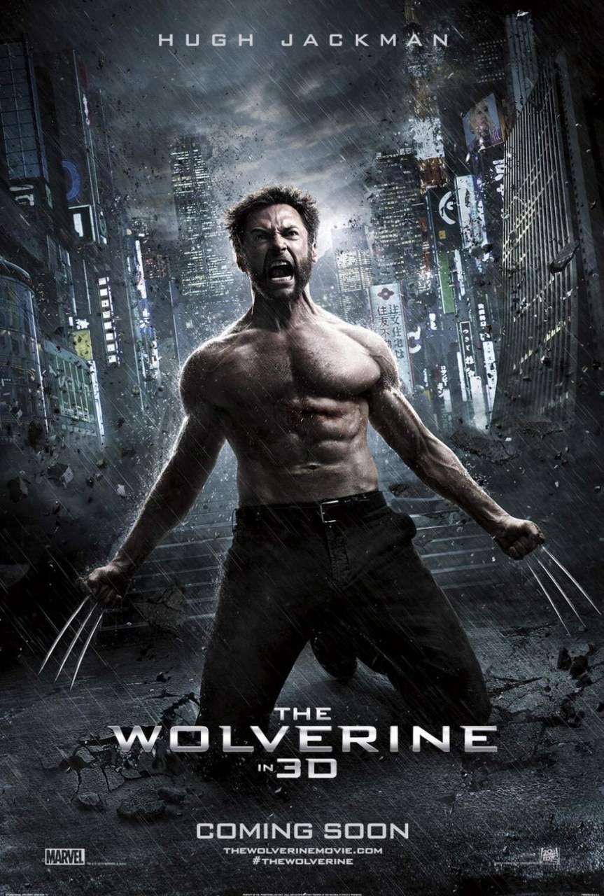
Logan
Director James Mangold
‘Logan’ is the most beautifully rendered film in the X-Man franchise, and the most visually unique of the bunch.
Mark Hughes, Forbes
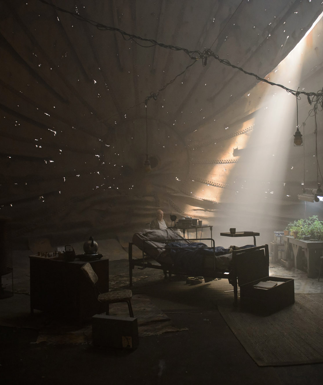
One of the first things I wrote was the scene with Charles and Logan in that big inverted water tank, I think it’s nearly eight minutes long… That scene, which I’m quite fond of, while it isn’t racy in language or violent, is still the result of the rating, because the movie was allowed to play as an adult film.
James Mangold
Chapter1
location
Charles Xavier’s
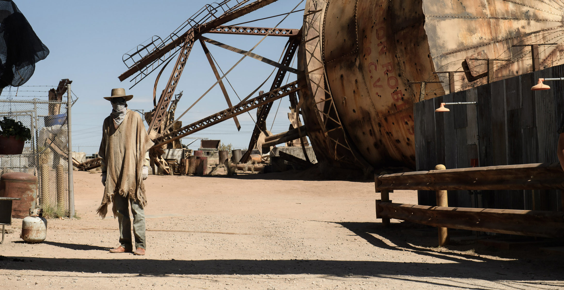
Water Tower
Read the full article
in perspective magazine
Early in development, one of James Mangold’s very first visions for the movie was an image of the aging Charles Xavier living in an abandoned bourbon distillery in Kentucky. This kernel of an idea, grew as the story outline took shape, and the setting transitioned to the desert outside Ciudad Juárez, Mexico.
Juárez and El Paso offered the contrast of twin cities strattling an international border, and offered potential danger and texture for Logan’s profession as a sort of Uber-esque limo driver.
After briefly considering the idea of an abandoned tequila distillery, Mangold and I were presented with haunting location photos of abandoned mining sites in the New Mexico desert. We researched smelting factories and felt that that it could be appropriate for a hideout. I didn’t want a big sprawling toxic dump—like an oil refinery for example—it didn’t feel like home, or like a place where you would hide out with your family.
During this process, Research Consultant Ozzy Inguanzo compiled remarkable photos of fallen water towers as inspiration. Jim knows a good idea when he sees one, and a fallen water tank became Professor X’s home.

protecting THE WORLD’S MOST POWERFUL MIND

© 20th Century Studios

As I started designing this tank, it started to really feel like a strange fever-dream version of Cerebro from the past X-Men films. When you first go into Cerebro, you’re greeted with a virtual star field. Those little rusted out holes in the water tank were intentional to create a subtle callback to this motif. I thought it could be a poetic bridge from Charles’ heyday to a sort of jail that he finds himself in in his old age. It was an intriguing metaphor.
Set Designer Walter Schneider was tasked with building a detailed 3D model of the water tower and surrounding buildings that we could view while scouting, giving us the ability to shape the interior and exterior simultaneously. The interior tank would be built in New Orleans as a traditional stage set, while the exterior was planned for the end of the shooting schedule near Alberquerque, New Mexico.
“Building a full-scale water tower was a large undertaking, compounded by the fact it had to be built on an angle, as it had collapsed and corroded,” said Chris Farmer. “François and the Construction Coordinator, Steve DeSantis, had thought to source a local tank manufacturer and buy all of the tank pieces, but using thinner gauge steel to make it more manageable.” For weeks, sheet metal and steel beams were lifted into the air, while two lifts with welding teams would lock them into place.
According to Farmer, “one of the challenges to the design was finding ways of building on a tight schedule with manageable materials, while keeping it strong enough to support the size of an actual water tower structure in a desert with high winds.”

The toppled water tank is one of many striking motifs in a production designed by François Audouy. [The film] achieves a narrative grandeur that’s grounded in humanity.
Joel Morgentern, the Wall street journal

Chapter2
Location
Ciudad Juárez, Mexico
Smelting Plant
Text by art director
jordan ferrer
When we began construction on the smelting plant location, principal photography was well under way in New Orleans. François and the team there had fully realized the interiors of the fallen water tank and smelting plant, which served as the decrepit hideout for Logan, Charles, and Caliban.
They had established a wonderfully dark, worn-out tone to the sets and it was then our job to make sure that all of the exteriors matched up.
Simultaneously, the main smelting plant structure and catwalks were being built to surround a functioning water pump-house. We had to ensure our building and painting didn’t interfere with this location, which was actively servicing local fresh water to the nearby city of Rio Rancho.
It was, of course, important to François that the smelting plant set looked believable as a working facility but have the age and erosion of a place deserted for decades. Set Decorator Peter Lando and his team added the details to sell the logic of the set: worn-out heavy machinery, long-since abandoned, coupled with the signs of life and make-shift solutions of this small crew of runaways.


© 20th Century Studios
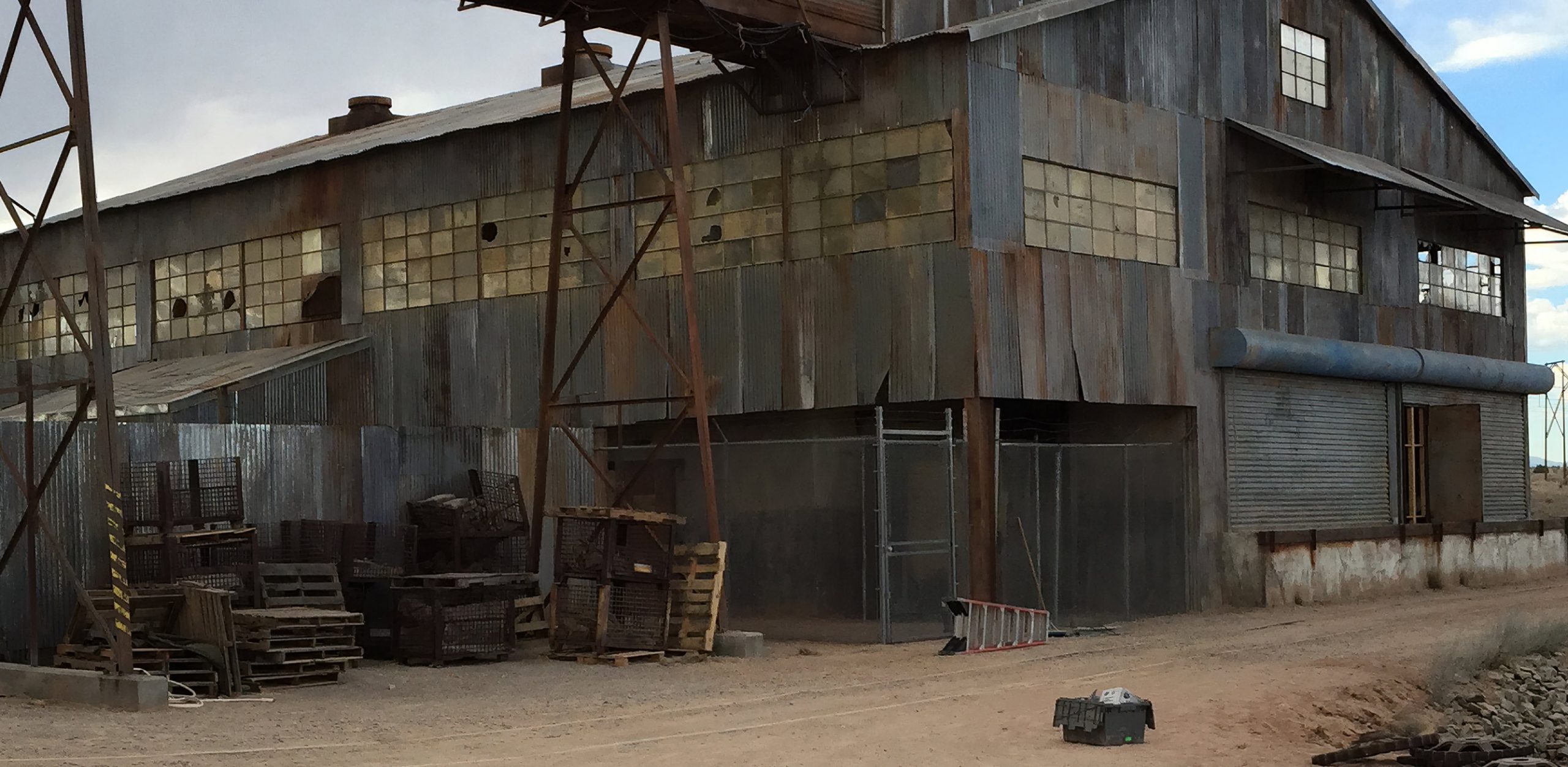
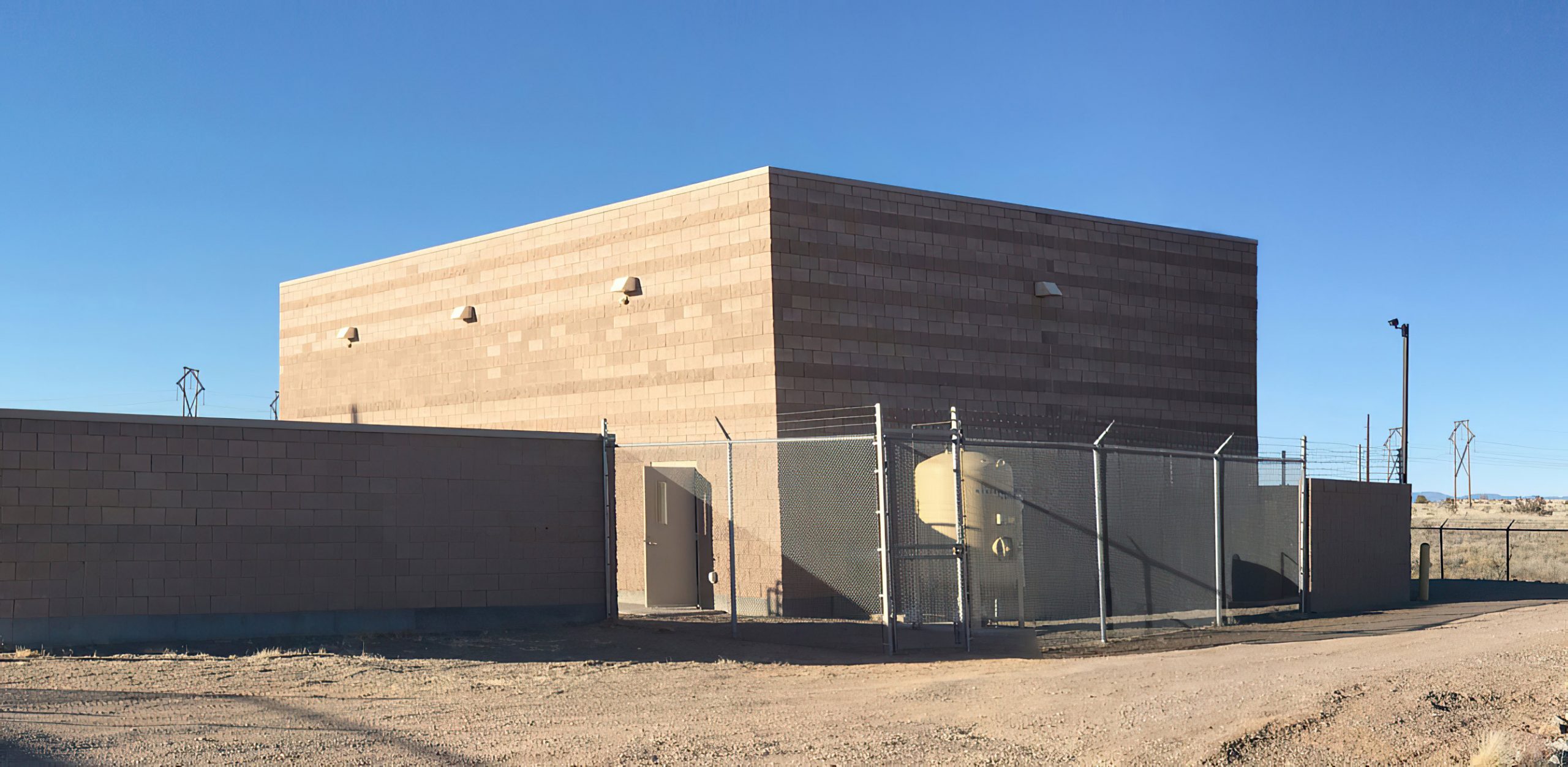
Including the peripheral fence and train tracks, the set took up eight acres and was designed to be shot from most sides. Though there were extensive story boards and previs, we wanted to be prepared for cameras to be set up anywhere and everywhere, so every detail counted. Sure enough, on an initial walk-through of the set with James Mangold and crew, it was decided that the elaborate wreckage of the collapsed tank legs deserved featuring and a portion of the car chase would then go through them. Needless to say, this led to some structural modifications.

© 20th Century Studios

Chapter3
location
Border Towns:
Ciudad Juárez & El Paso
When James Mangold sparked to the twin locales of Ciudad Juárez and El Paso as the setting for the film’s opening, work started on finding details that set the table for this near-future world. Logan is now a nocturnal limo driver, with the unglamorous burden of shuttling clients around this inauspicious border town.
We made the decision to make “Logan” in more of a retro style of filmmaking by shooting on location as much as possible and utilizing limited CGI. For example, while it would have been easier to shoot the driving sequences on a soundstage with green screens, those sequences were shot driving through real, distant locations, which created a more grounded and realistic feeling.

© 20th Century Studios

“I had this kind of strange vision in my head that I wanted to make a road movie with these characters, in a way almost trapping myself as a filmmaker. We couldn’t do something about worlds colliding or an alien invasion—the movie would essentially force itself to operate on a more intimate level.”
James Mangold
“The Statue of Liberty was a long time ago, Charles, a long time. There are no new mutants. Understand? Hasn’t been a new one born in 25 years. Not anywhere.”
Hugh Jackman as Logan

© 20th Century Studios

Concept art of the Liberty Motor Motel and the final dressed location in New Orleans.
Photo BY Ben Rothstein
© 20th Century Studios
Illustration (BELOW) by CONCEPT ARTIST SHAE SHATZ
© 20th Century Studios

Chapter4
Picture Cars
Logan’s Limo & Other
Specialty Builds
To help design the near-future vehicles required for the film, I turned to Concept Illustrator and Vehicle Designer Nick Pugh, who approached the creative process of designing Logan’s limousine as if we were actually designing a next-generational automobile for one of Detroit’s automobile “big three” manufacturers. Moreover, the limo had dual challenges of being a reflection of Logan’s character, but also suitably fitting into the world we were building for Logan to inhabit.

© 20th Century Studios
Text by art director & vehicle designer
Nick Pugh
James Mangold had a clear vision that the designs in his film be “realistic” and not distract from the characters or story. This posed a challenge for someone who loves to design wild, futuristic vehicles! We would present a range of possible directions and he would usually select the most conservative version. I learned that ultimately this is the most important thing in making a cohesive and believable movie. No matter how cool something appears to be on the surface, if it distracts the audience from the story, it doesn’t work in terms of narrative design.
Exterior Styling
We wanted the look of the car to be very strong, masculine and simple. It was to be a sort of hybrid between a sedan and an SUV, where surfacing created large simple shapes accented by unique and severe details. An austere palette of black paint and chrome created a classic limo feel. The car is supposed to be realistic but slightly different from what is out there now, with a subtle futuristic twist. The front and rear views are conventional but the headlight and tail light designs give the limo a unique identity both in the daylight and at night.

© 20th Century Studios

© 20th Century Studios
For me, the designing process usually starts out with old-fashioned drawings on paper. In this case, I used black marker sketches of the vehicle in various views. Once François and Jim approved a direction, I went right to building a rough model in 3D. Once I was happy with the model, I rendered it using Keyshot and then touched up the renderings in Photoshop. All of this was being done in conjunction with the pursuit of a car company partner, so each round of designs had to be branded with specific company badging and styling. I also did a full-sized, side view tape drawing for everyone to visualize the scale and proportions of our limo.
The limo design was finalized in about four months. At this point, we needed to create a “class A” model based on my rough 3D design that could be used as a basis for the engineering and eventual full sized 3D printing of the parts.
This was done in ICEM Surf by Ghostlight Industries, where the cars would eventually be fabricated. As part of our process, we built a 1/5th scale model that would verify and show our design in physical space. People tend to forget the importance of seeing something as subtle as automotive surfacing in real life. It’s a great moment in the design process when you can close your eyes and run your hands across the smooth painted shapes of a model and feel the creative choices you have made in your mind’s eye.
It had been decided early on in the process that we were going to build a fully custom chassis, body, and interior. This made sense considering the performance demands of the story, and since we needed to build four different vehicles. But only a week before the studio was to approve this direction, it was suggested it might be more cost effective to use an existing production car instead, especially considering that the script featured less of the limo than originally planned.
20th Century Fox partnered with with FCA, which was fortuitous as the Chrysler 300 had been an inspiration for some of the limo styling. To save money, we built over actual 300s provided by FCA, but this posed significant challenges for us at this late stage in the process. The biggest one being that the overall proportion of our design relied on maintaining a specific height/width relationship and the 300 forced us to lose about 6” of width and keep the height, resulting in the car looking stumpy and top heavy.

© 20th Century Studios
“I don’t know any Gabriela, so get the f*** out of my car.”
Hugh Jackman as Logan

© 20th Century Studios
Interior Design
The look and feel of the interior is simple and masculine. We wanted to create a design that blurred the lines between something classic and futuristic. The dash and instrument panel are large touchscreens, but instead of a futuristic graphic interface we chose a retro chrome and dial look, thus blending the futuristic function of a touchscreen with a classic style. The seating was inspired by iconic mid-century furniture such as the Barcelona chair and Eames lounger.


© 20th Century Studios
The Command Truck
The script called for our heros to be pursued by the Alkali Corporation, with a lead vehicle that would serve as a mobile command post. A wide net was cast to find interesting vehicles that could be modified into a unique and futuristic design. An odd-looking type of terminal tractor (called a “Yard Mule” or sometimes a “Yard Goat”) used to move semi trailers within cargo yards was found for the base vehicle, and a custom rear trailer was fitted to the rear by Ghostlight Industries.

Chapter5
character design
The Reavers
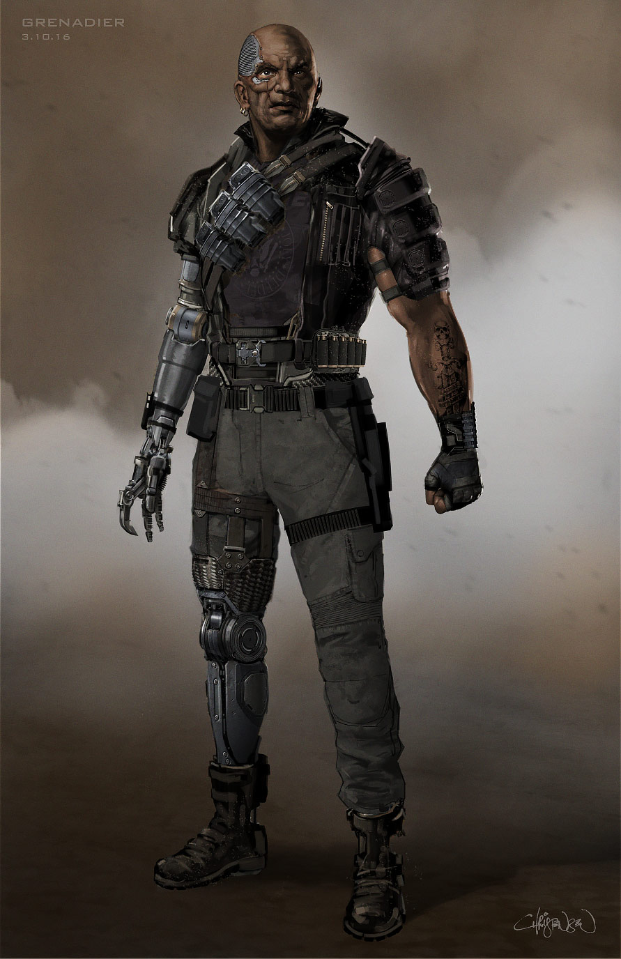
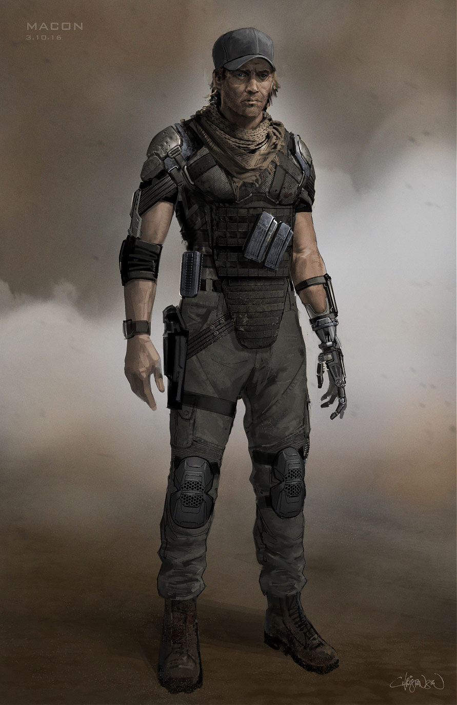
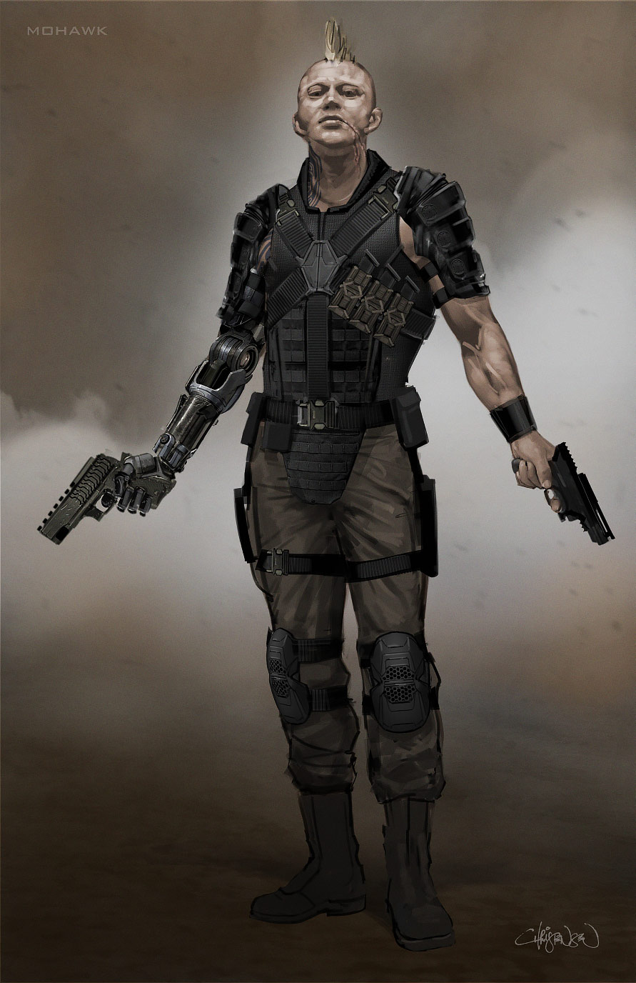
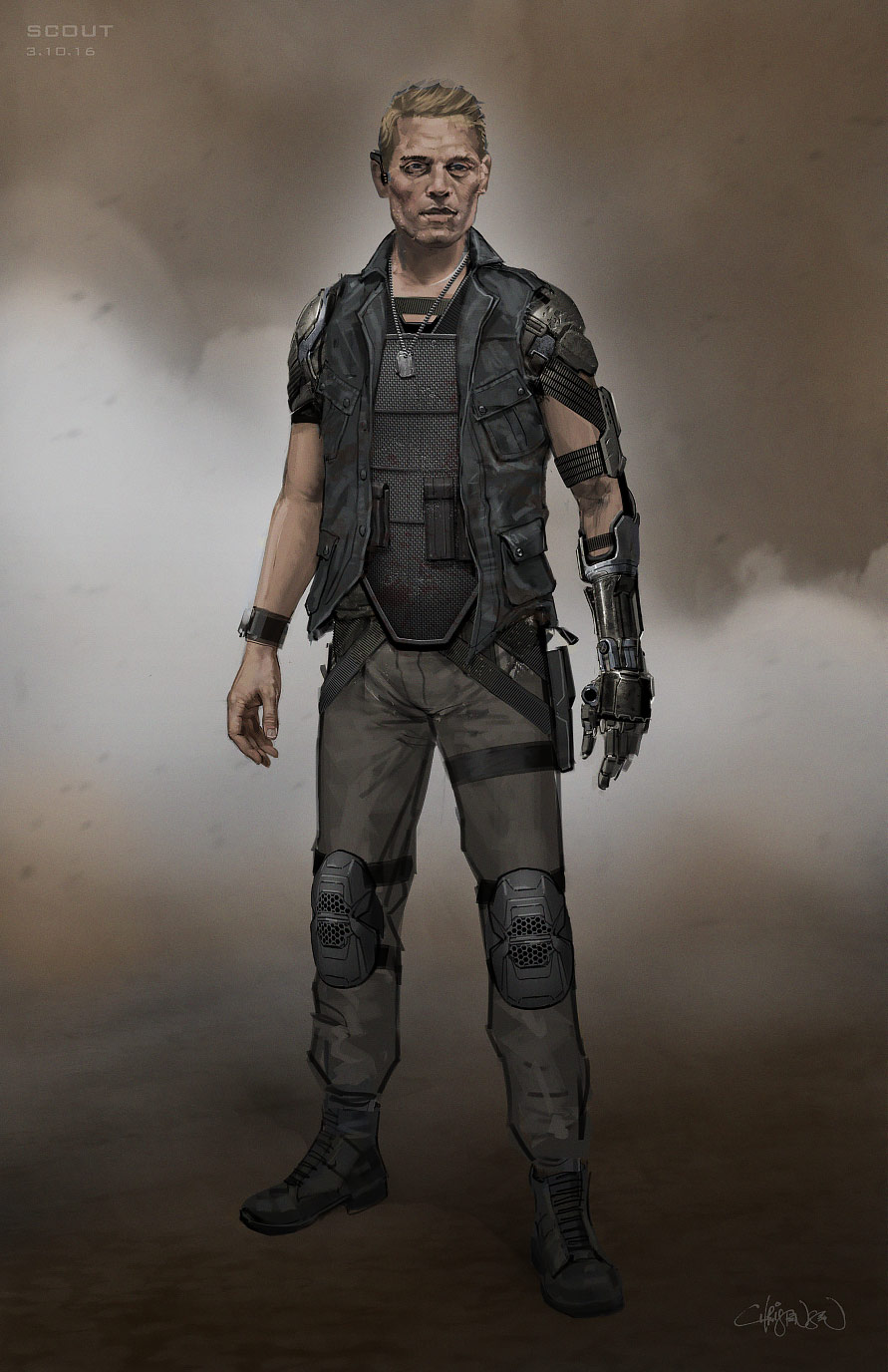
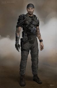
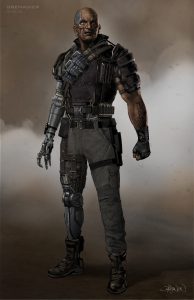
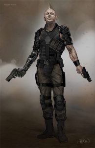
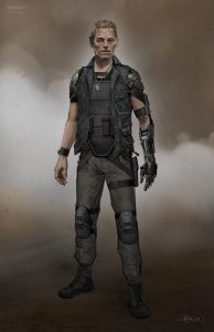
In the X-Men comics, the Reavers, lead by Donald Pierce, are a gang of cyborg mercenaries who have a personal beef with the X-Men—Logan in particular—for their many defeats.
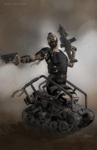
During development, the Reavers’ cybernetic limbs were going to be more featured, and rely on extensive (and expensive) CGI. Dozens of illustrations were created to not only explore the design opportunities for these complicated props, but also develop these various characters costumes and style.

Gallery
One of the Reavers that was cut from the script named “Bonebreaker,” had legs that had been replaced with a tank-style chassis.

As part of the design process, I went so far as sourcing a practical off-road tank vehicle for Bonebreaker that would have been capable of driving at 40+ mph. At a late hour, Bonebreaker was scrapped for the script.

© 20th Century Studios

Donald Pierce’s robotic hand was a practical glove for wide shots, and CG effect for close ups.

© 20th Century Studios
The Reavers trucks were modified 2017 Dodge Ram pickups provided to the production by the FCA Group.

Chapter6
Locations & Stage
Oklahoma City Casino
& Car Dealership

From the early days of story development, James Mangold insisted he wanted to capture the feeling of landing on contrasting “cultural islands” during this journey, with distinctive styles to each.
The scriptwriting and production design occurred in tandem in a very holistic and organic way. As this was ultimately a “road trip” story, multiple paths northward from El Paso were explored. Early in the writing process, there was an idea for our characters to stop in Las Vegas, but we decided on Oklahoma City when Vegas was deemed too far west.
The interior of the Oklahoma Casino was the first sequence to shoot on stage in New Orleans. The large suite was built with an en-suite bathroom and connected corridor and elevators.


© 20th Century Studios
The original intent was to shoot the exterior scenes at Harrah’s Casino in downtown New Orleans. However, plans were forced to change when a sinkhole suddenly opened up in the street directly in front of the building. A new set was conceived at a very late hour, to be built outside of the Superdome.
The new set was designed and fabricated in the span of one week, with our construction crew working 48 hours straight in the final push to complete the build in time for principal photography. The paint was still wet when cameras arrived.

© 20th Century Studios
Chapter7
Locations & Stage
A 185-year-old Farmhouse
in Corn Country
For most of the shoot, we were based in the New Orleans area, but we also traveled 200 miles north to shoot a farmhouse built in 1829, situated near the small town of Ferriday.
This was the only part of Louisiana with a prevalence of cornfields, which were required for the story. At the farm location, a horse stable was built to cover an existing metal shed, and loads of practical lighting was installed for the needs of several nights of photography.

© 20th Century Studios


© 20th Century Studios
The entire interior of the farmhouse was built on stage in New Orleans, and was one of the first sets to be shot in the schedule.
After several long nights of shooting in the mosquito-infested farmlands of Louisiana, there was a renewed appreciation for the benefits of shooting on stage.
Chapter8
Location
The End of the Road:
“Eden”
Text by art director
Jordan Ferrer
Four hours North of Albuquerque, in Abiquiu, was the location for the lookout tower. This was practical set built right on the edge of a sandstone cliff, which allowed for stunning vistas of desert mesas in all directions.
We became aware of the fierce winds and storms that came through those canyons, so we consulted with a structural engineer to make sure our construction would hold. The design was to look rickety and run-down, as it was a long-abandoned fire-watch tower, so in some areas steel members were clad with wood. The bunkhouse that accompanied the lookout tower was built on-site as an exterior set, while an existing cabin further north would be modified to be the interior.


© 20th Century Studios
Due to unpredictable weather though, we were forced to build and dress interiors in both areas simultaneously to allow for cover depending on where we were shooting.
Our final shooting location was a few more hours north at the foot of the Brazos Cliffs in Chama. This proved to be an impressive backdrop for the final action scenes. Several hours of highway separated our sets in New Mexico, so it wasn’t uncommon to race up to the northern border, drive down to Abiquiu for construction of the lookout tower, and then continue on a few more hours to Rio Rancho to see the final touches on the smelting plant set.


© 20th Century Studios
In the end though, the varied locations that New Mexico and Louisiana offered allowed us to sell a trip from Mexico to the Canadian border.
A practical hoist and tackle was built by the SFX department, allowing Hugh Jackman to be craned to safety without the use of CGI.


© 20th Century Studios
Art Department Credits
- Supervising Art Director
- Chris Farmer
- Art Directors
- Scott Plauché
- Jordan Ferrer
- Assistant Art Directors
- Matt Gatlin
- Christina Kim
- Set Decorator
- Peter Lando
- Vehicle Art Director
- Luke Freeborn
- Research Consultant
- Ozzy Inguanzo
- Concept Illustrators
- Nick Pugh
- Shae Shatz
- Paul Ozzimo
- Landon Lott
- Set Designers
- Kevin Loo
- Trinh Vu
- Walter Schneider
- Brian Waits
- Nicole Lefevre
- Jessica Stumpf
- Storyboard Artists
- Gabriel Hardman
- Marc A. Vena
- John Coven
- Graphic Designers
- Stephanie Charbonneau
- Will Eastin
- Roger Johnson

